
What to Expect
1. Overview
As the Lead Product Designer of the consumer experience at Snap Finance, I was responsible for driving the 0-to-1 design of their first mobile app, spanning account servicing, originations (financing application), shopping, and Auth experiences.
I directly contributed to shaping and prioritizing product, design, and engineering roadmaps and backlogs, led a cross-functional workshop and multiple discovery research sessions to identify areas of opportunity to enhance the experience and drive KPIs, helped develop a new brand language, and spearheaded the adoption of Snap’s first design system, Mercury.
Role
Lead Product Designer
Collaborators
4 Product Managers; 2 Product Owners; 6 Engineering teams; Legal & Compliance; Marketing
Methodologies
UX
UI
Content
Prototyping
Usability Research
Live Experimentation
Stakeholder Buy-in
Heuristic Analyses
Workshops
Roadmap Prioritization
Company
Snap Finance is a decade-old BNPL lease-to-own and loan financing company serving more than 3M customers, with a focus on helping consumers who do not qualify for traditional financing afford larger living expenses and durable goods. In 2024, Snap financed more than $1B, with a revenue of nearly $250M.
Challenge
The legacy web presence for the financing application process and account servicing was disjointed and cumbersome (on both the front- and back-ends). Customer login to the account servicing experience hovered in the single digits, negatively affecting trust and engagement.
Requirements & Goals
Increase trust and transparency via improved access to account servicing and repayments
Increase both new and returning customer application submissions
Decrease call center volume by improving access to account servicing features
Unify Snap’s omnichannel brand with a new, engaging visual design language
Key Metrics – Year One
500k
Downloads
+38%
Increase in payment
submissions over web
17k
Unique weekly active users
+52%
Application submission rate
improvement over web
4.9⭐
App Store rating
-64%
Application submission time
reduction for return customers
Best Overall FinTech Mobile App
FinTech Breakthrough Awards 2025
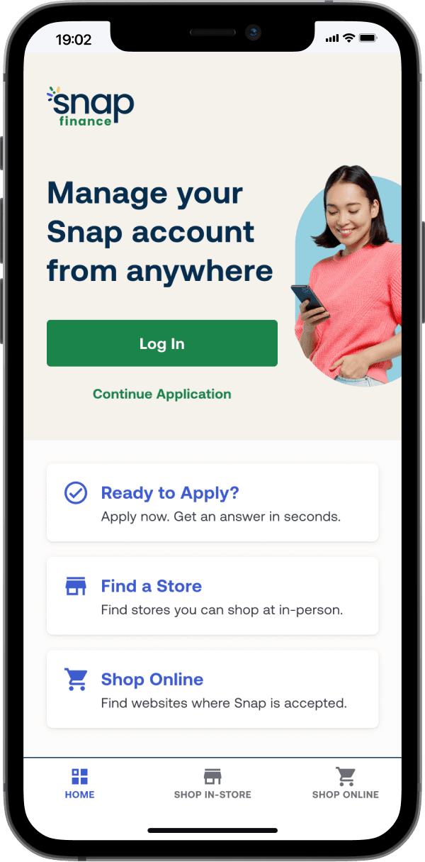
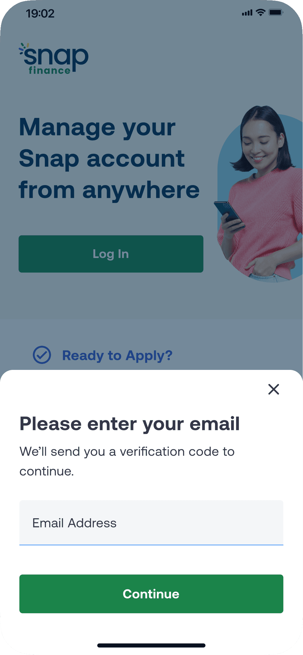
2. Auth & Login
The Challenge
How might we guide the 3 existing customers types to their intended task(s) when they land on the home screen?
Initial Exploration
Wireframes based on existing customer types and legacy backend architecture uncovered multiple customer pain points and technical issues.
–
Requires user to understand internal architecture, causing frustration
–
Separate application entrypoints do not share backend endpoints nor check for returning customers, creating tech debt and a cumbersome experience
–
Separate entrypoints for the same user lead to different feature access, causing click avoidance and confusion
–
No way for logged in customers to continue an application or apply again, reducing submissions

Iterated Release v1.0
Be smarter and do the thinking for the customer
A hub & spoke login model allows multiple entrypoints to be combined, reducing cognitive load on the customer.
A reusable, cross-platform backend "Determine Endpoint" was implemented to handle customer identification, reducing tech debt by standardizing the Auth process.
Reducing application submission time by 64% (from 7+ to 2.5 minutes) for known customers
Checking the database to see if a "new" customer has previously applied when they start a new application will now serve known customers prefilled applications, greatly reducing time on task and increasing submissions.
Decreasing tech debt through reusable backend Auth modules
I partnered with engineering to implement the "Verification Module," a cross-platform, entrypoint-agnostic module that can be reused across any application entrypoint to check customer identity, creating a seamless customer-facing experience and reducing backend maintenance resources.

Iterated Release v2.0
A quick band-aid fix to plug a security oversight
InfoSec discovered a post-launch security risk when surfacing account validity based on a standalone email input.
My 3-in-a-box team addressed this during a late-night session by adding an email OTP step, which plugged the security risk but made the user experience more cumbersome.
Solving for call center feedback to reduce customer confusion
The call center was getting calls that Returning Applicants (w/out accounts) were confused on how to access their in-progress applications.
I had to re-introduce the 3rd "continue application" entrypoint that I had tried to eliminate in v1.0, reducing call center volume and customer confusion.
The new "Verification Module" was shared with this entrypoint, reducing engineering implementation costs.

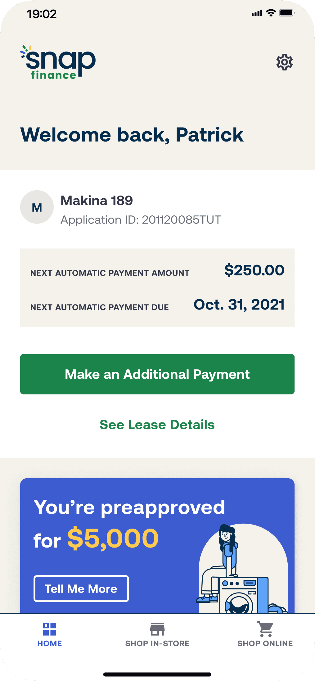
3. Home
MVP Design Solution
Multiple last minute pivots surfaced just prior to launch.
New Product leadership shifted focus to a “soft launch” for Existing Customers & Account Servicing, from new customer acquisition
I created a new headline and redesigned the Hero section
The 2nd of 2 corporate rebrands and a new brand language was introduced
Working with the new Creative Director, I concepted a new brand treatment using models in the “sprinkle” shape pulled from the new logo
The sand/white split background treatment was adopted by my design team and applied throughout the app for increased cohesiveness
Snap’s first official design system, Mercury, was implemented
My VP nicknamed me the “Godfather of the Design System” for evangelizing and getting leadership buy-in to invest resources, while collaborating with Engineering on execution and approach
Design Evolution for .Com Home
A redesigned web & mobile web Home screen to be more cohesive with the new brand language, focusing on new customer acquisition and originations.
+
Increased .com application starts by +5.5%
+
Product visuals were noted as enticing for shoppers in usability testing
+
More cohesive cross-platform branding
–
Some customers were confused by carousel-like design as a shopping category selection
–
Experimentation on mobile app was not pursued

North Star Home Redesign PoC Prototype
A self-initiated project exploring a scalable framework to bring multiple isolated initiatives together into a cohesive experience.
A scalable framework for a crawl-walk-run approach to iterative releases, reducing future redesigns and rebuilds
My horizontal view across extended teams revealed a lack of collaboration on how these initiatives would fit together in the existing app structure
With ambiguous release timelines for each initiative, my goal was to create a guiding framework that flex with shifting release plans
Allows the team to pick and choose what would be released in what order, without needing to redesign the front end or rebuild the back end each time
An evolution, not a full change in course
I used a lot of existing UI components, content, and graphics to prevent leadership and extended teams from being overwhelmed by potential tech debt or new work
Democratizing design
Allow extended teams autonomy and ownership to design and test within their own modules, while ensuring cohesion across the customer experience
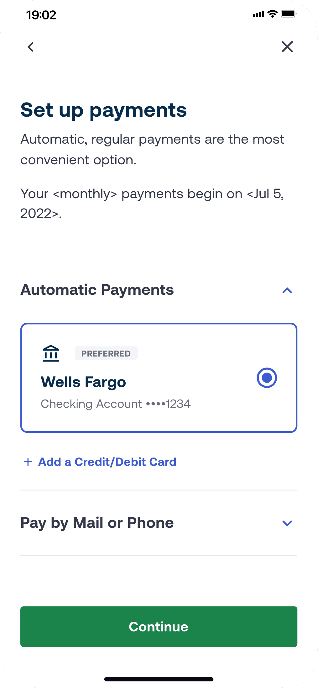
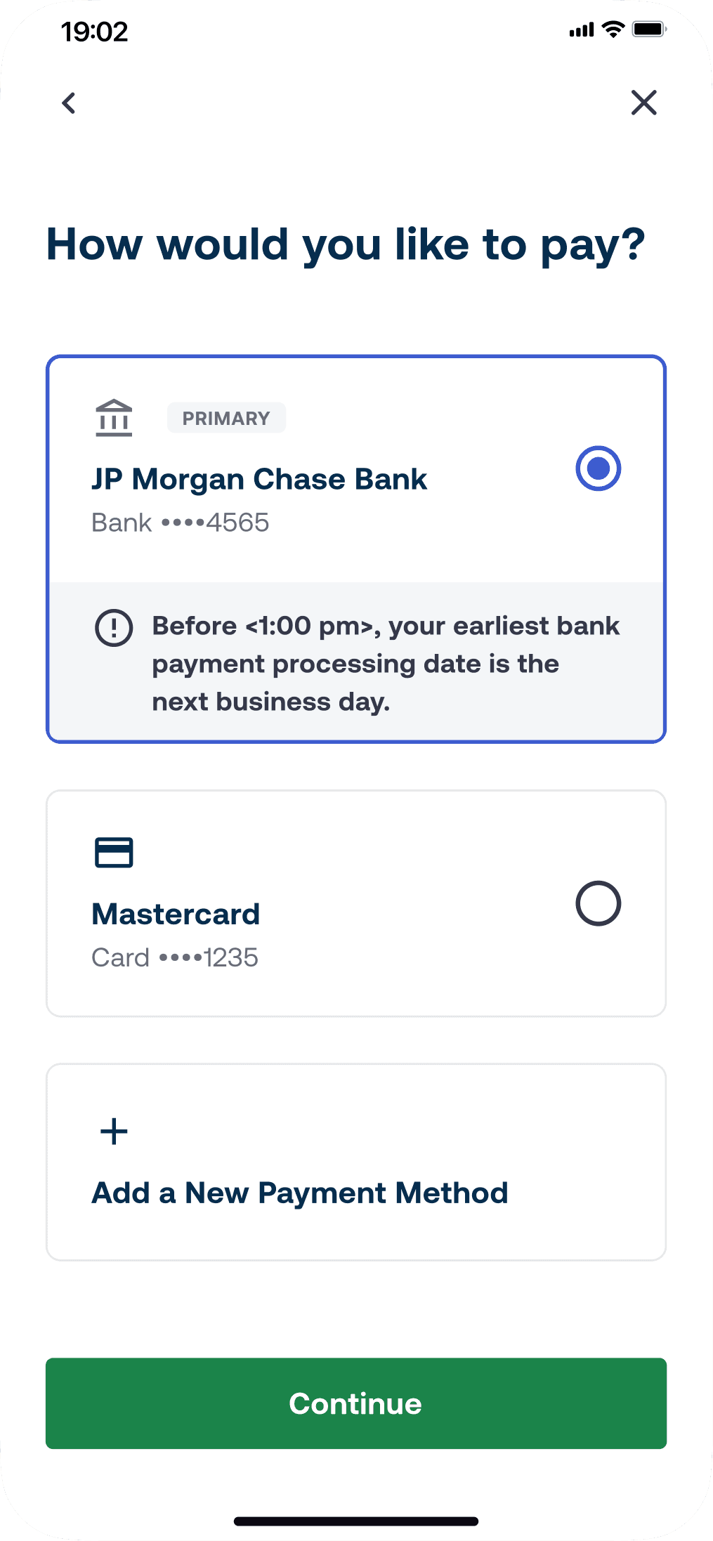
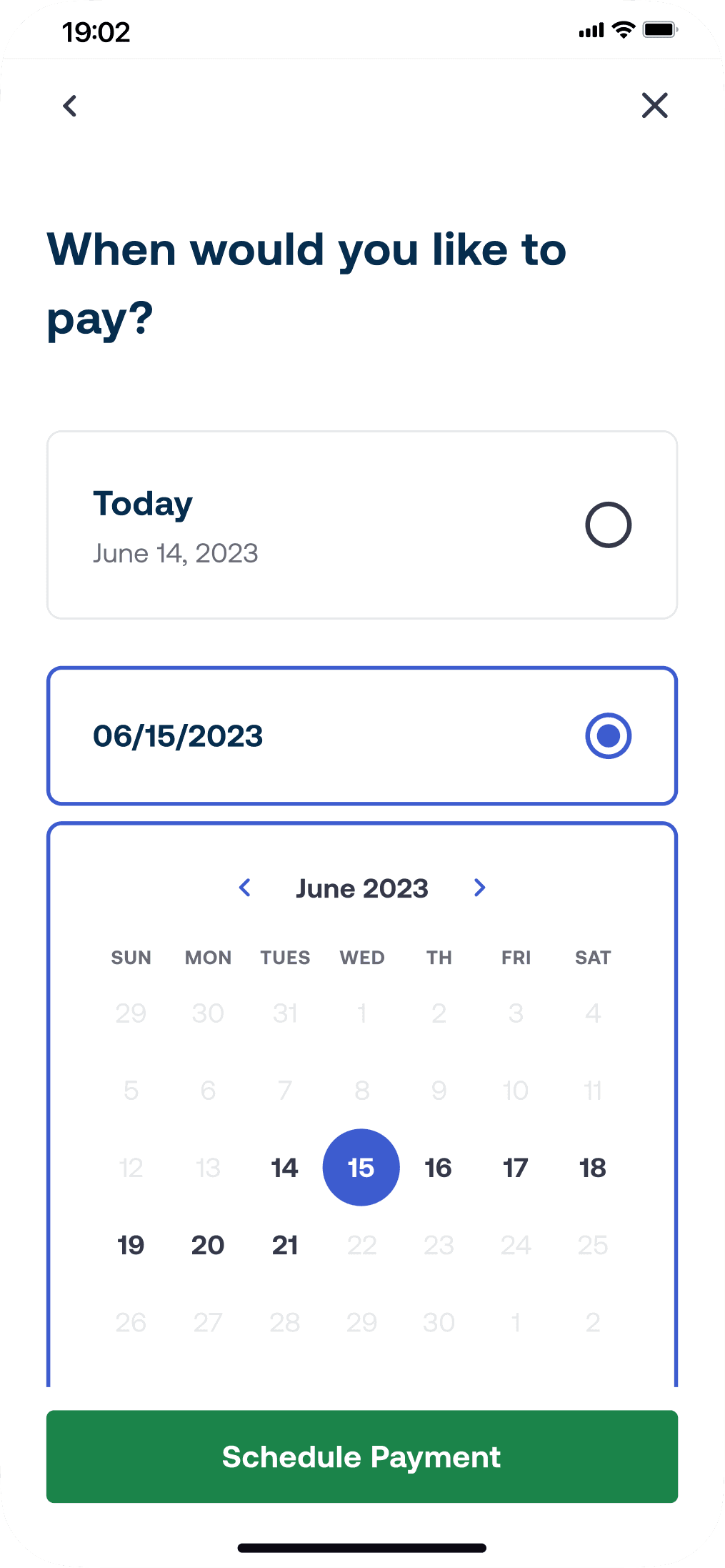
4. Financing Application Flow
Applying Best Practices & Industry Experience to Improve the Legacy Experience
Prior to translating the legacy web-based application flow to mobile web, heuristic analysis led me to believe a light weight update focused on layout and clarity improvements could improve submission rates.
Outcomes
52% improvement in submission rates over legacy web
Reduced time on task from over 7 minutes down to 2.5 minutes (64% reduction) by showing a prefilled application to known/previous customers
Legacy pain points solved for
–
Customer has to read through 3 to 4 pieces of repetitive content before getting to interactive forms
–
Progress meter was unhelpful because flow length could change depending on responses
–
Horizontal navigation buttons caused issues in longer languages
–
Disabled primary CTA caused frustration when missing fields
–
Language toggle not discoverable – buried at bottom of screen


Finding Quick Wins to Move the Needle
I led a cross-functional workshop of the E2E application flow with the goal of finding areas that could ultimately improve completion rates. We uncovered quick wins to tackle immediately and long term enhancements for the backlog.
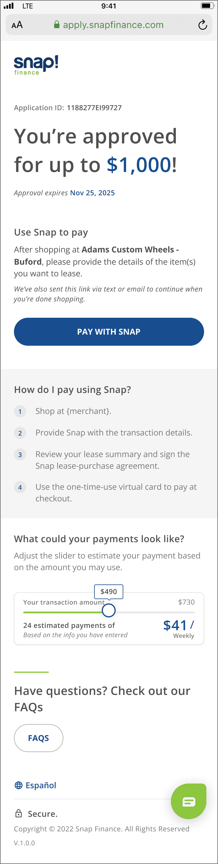
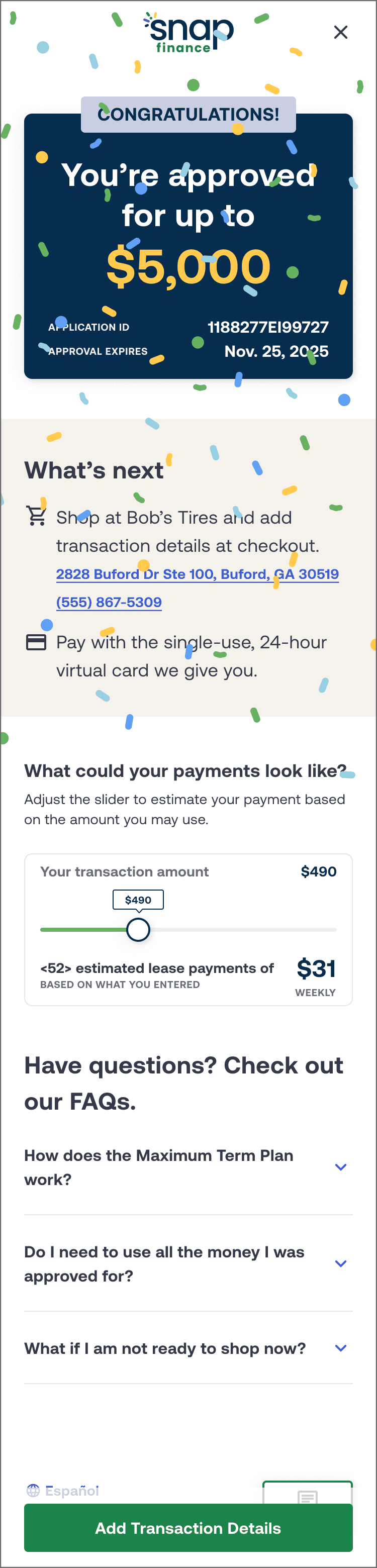
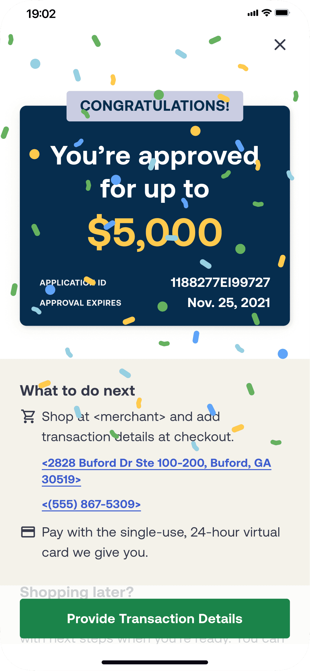
The "Approval screen" was identified as one of the highest dropoff rates in the flow, and redesigning this screen seemed like a lightweight, quick fix that could help increase completion rates.
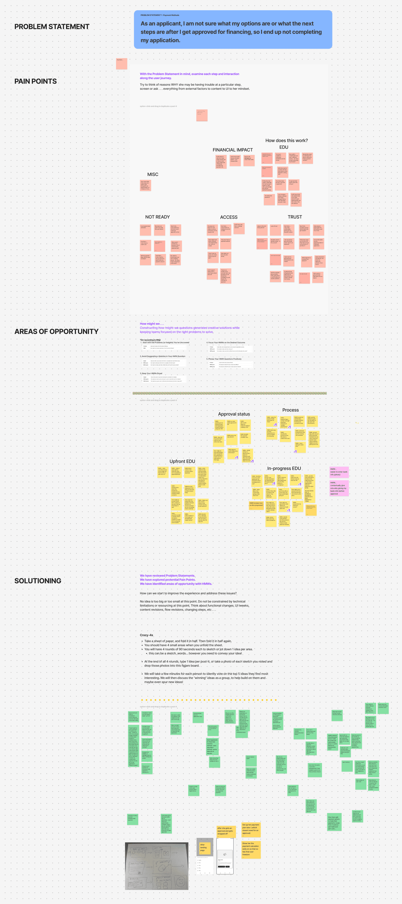
How might we improve the Approval step to increase application completions?
Previous customer research showed that customers were confused on what to do next once they are approved.
Leveraging heuristic analysis and best practices, I identified potential pain points with the goal of solving for greater clarity, transparency, and user comprehension.
Key Pain Points to Solve For:
Primary CTA was misleading and caused click avoidance for users not ready to pay yet – the next steps are actually to review and sign T&Cs, and find out actual payment amounts
The inline CTA prevented scrolling further down the page to discover more info
“Next steps” below CTA caused most users to miss them
The FAQ link took the customer out of the flow
A Simple Redesign with a $30M Impact
Cleaned up hierarchy, page flow, and content to increase legibility, comprehension, and transparency.
Added a moment of joy to make the approval step feel more celebratory with a confetti animation and slight haptic shake.
Outcome
+56% increase in scrolling to read additional content on the page
+2.3% (relative) increase in application completions
+$30M increase in annual funding
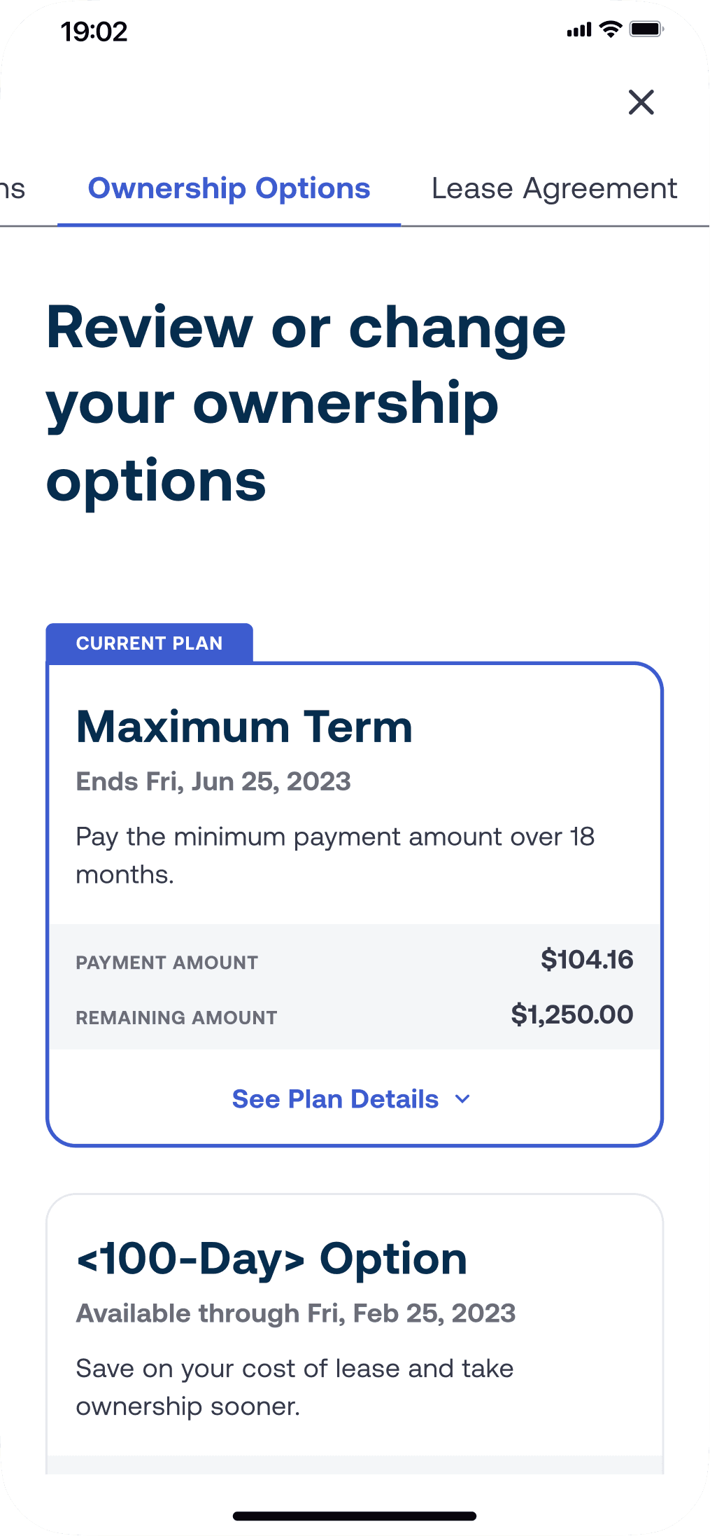
5. Curated Selection of Screens


5. Takeaways
Don’t assume
Just because it is currently built one way does not mean it is “correct” or “secure”
Make sure all extended stakeholders have a chance to review and sign off
A marathon, not a sprint
Having a project or concept shelved does not mean it’s bad – it just might not be the right time
Scalable framework thinking allows flexibility and piecemeal prioritization
A north star concept can bridge silos
Generates excitement, new ideas, and collaboration
Helps get abandoned projects back on the roadmap