What to Expect
1. Overview
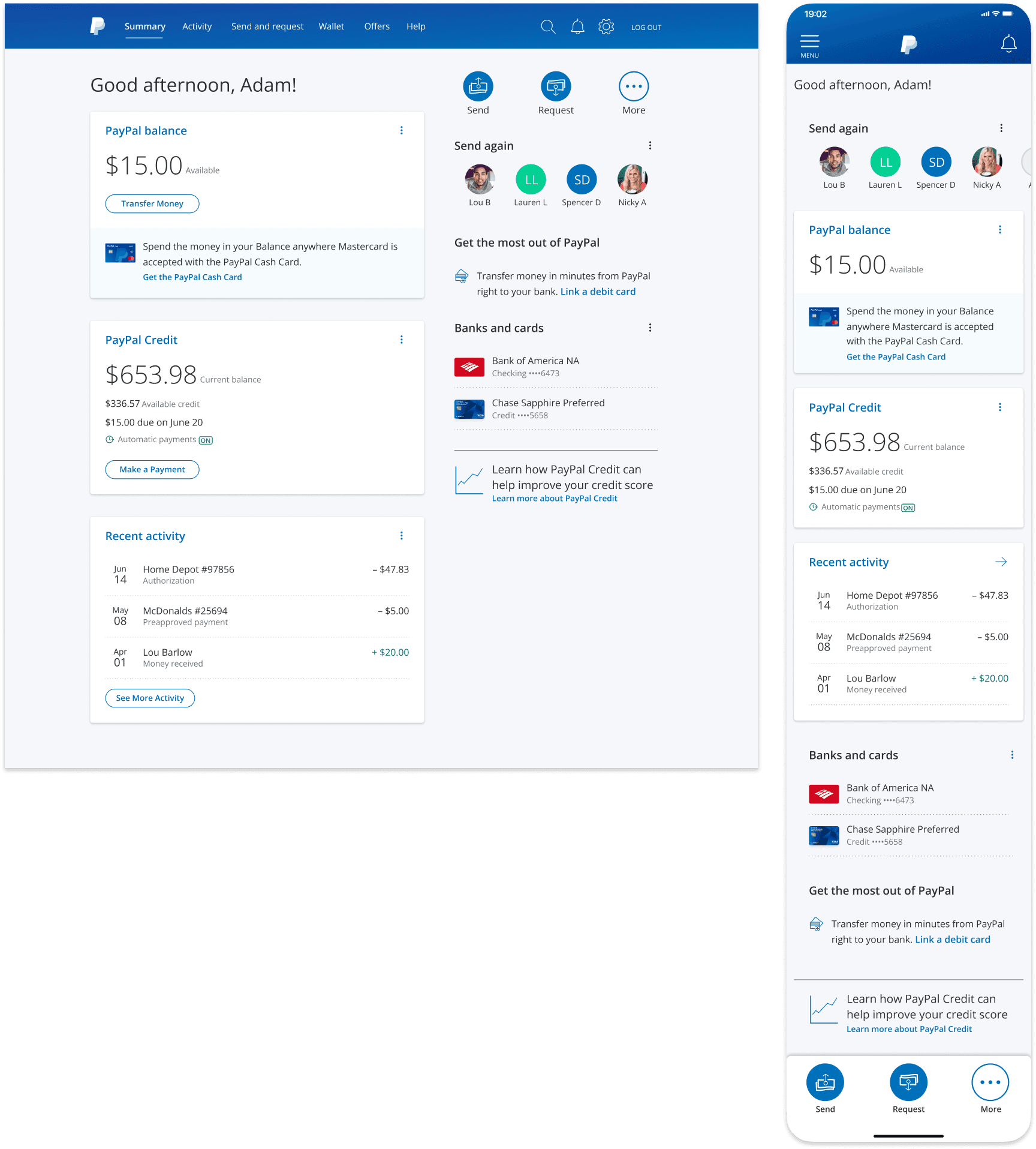
As the Lead Product Designer on the Consumer Home team, I led the redesign of the account servicing dashboard serving 500K+ DAU, transforming a rigid legacy experience into a unified, scalable cross-platform servicing ecosystem. I established UX, UI, and messaging frameworks based on countless "self-service" usability sessions and requirements from extended product teams, starting on web and translating over to the subsequent Digital Wallet super app redesign.
I partnered with the engineering team on the creation of a novel 3x-patented backend architecture to drive engagement by tailoring the experience as the customer progresses through their PayPal lifecycle, while striving to maintain an at-a-glance, personalized view that highlights the overall status of the customer’s account.
Role
Lead Product Designer
Collaborators
Product Design Manager; Content Designer; Product Director; Product Manager; Engineering team; Design Systems team; Extended Product/Feature teams
Methodologies
UX
UI
Content
Frameworks Thinking
Prototyping
Usability Research
Stakeholder Buy-in
Live Experimentation
Workshops
Roadmap Prioritization
Company
PayPal is a leading Fortune 200 FinTech operating a global P2P and online payments platform with nearly 500M active accounts and a total payment volume of more than $220B.
Challenge
With a growing portfolio of innovative new products, the previous “one size fits all” approach to the Home was starting to burst at the seams, causing a bloated and unstructured customer experience, while lacking the ability to scale and promote new products, features, and actions.
Requirements & Goals
Establish a scalable dashboard framework to apply across web, mWeb, and mobile app
"Win P2P" initiative – Increase P2P total payment volume
Create additional channels and patterns for communication and promotion
Drive increased traffic to internal feature pages via improved IA
Increase 30-day engagement and adoption of additional products
Key Metrics
267M
Active PayPal accounts
3
US patents earned
+40%
30-day engagement (relative)
18
Product & Messaging Tile types defined
+46%
Quarterly P2P volume
∞
Dashboard layout possibilities
Editor’s Choice Awards – US Wallet App Category
Apple App Store & Google Play Store
2. Legacy Home Experimentation & Learnings


These early experiments set the foundation for the personalized, lifecycle-based, modular dashboard framework concept the new Home screen would be based on.
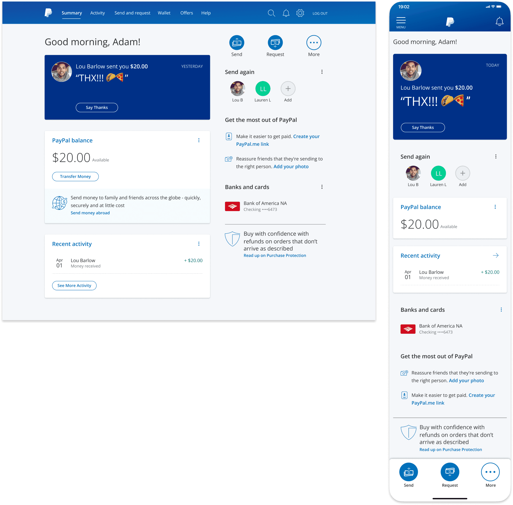
3. Modular UX Framework
A Personalized Experience Starts by Reinventing our Backend Architecture
Our goal was to drive engagement by tailoring the experience as the customer progresses through their PayPal lifecycle, striving to maintain an at-a-glance, personalized view that highlights the overall status of the customer’s account, by focusing on:
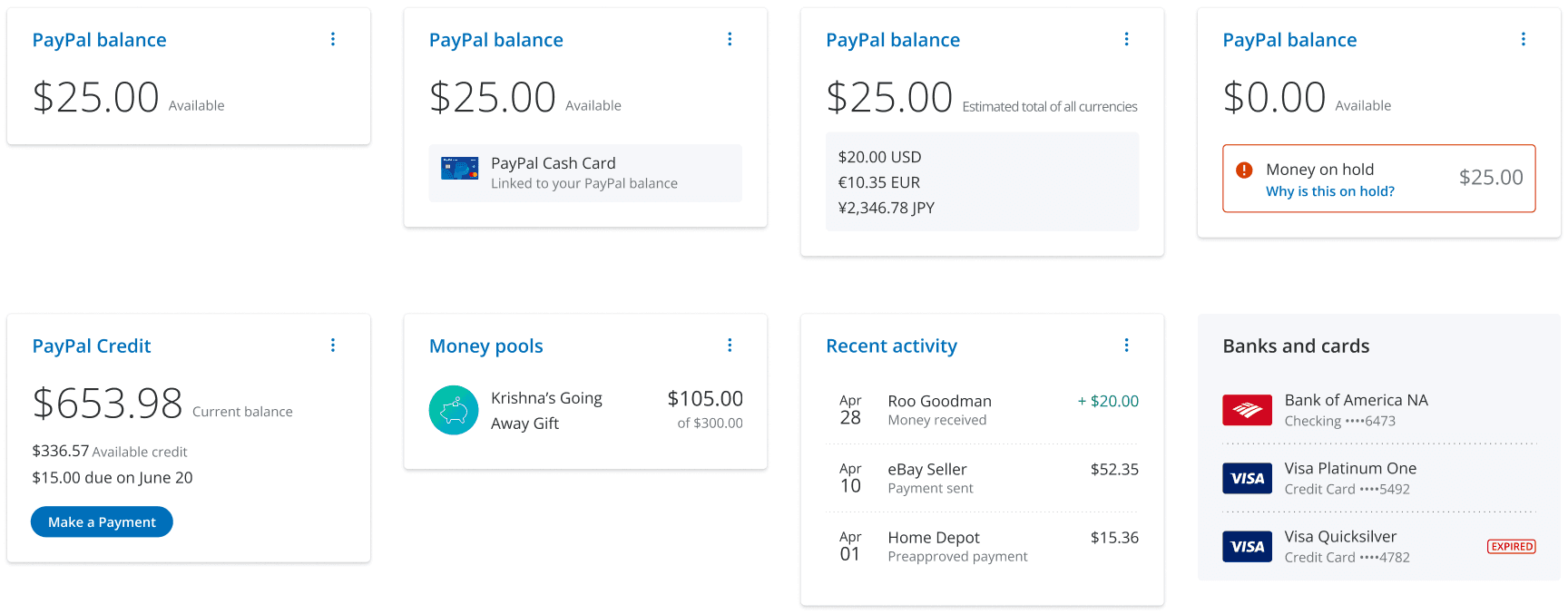
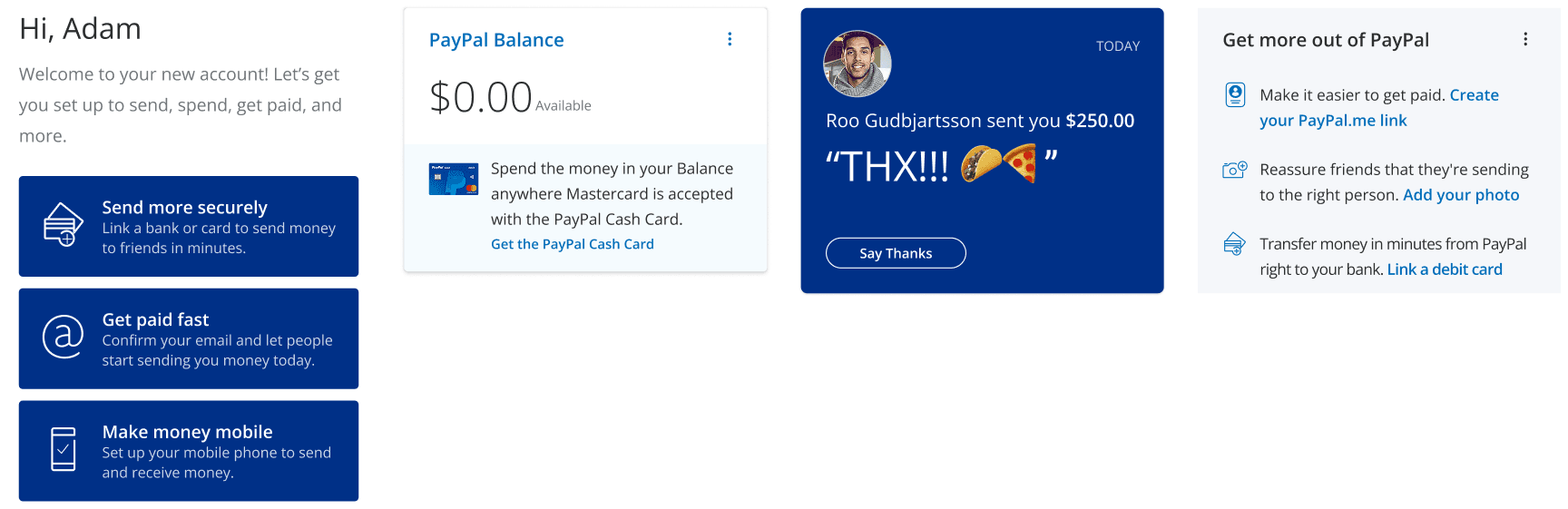
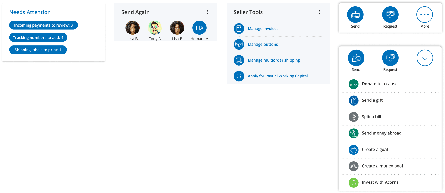
An easily digestible snapshot of the current status of the customer’s financial account(s)
What the customer needs to take care of today and in the immediate future
Ways the customer can improve and build their own PayPal experience

The solution was a flexible, yet regulated, Home layout, smartly populated by a framework of tiles with clear, comprehensive guidelines, reducing churn and increasing release cycles by allowing internal 3-in-a-box teams autonomy to iterate on their own tiles.
The backend architecture to build out this dynamic, smart dashboard concept earned 3 US patents (11829704, 11341313 & 10970459).
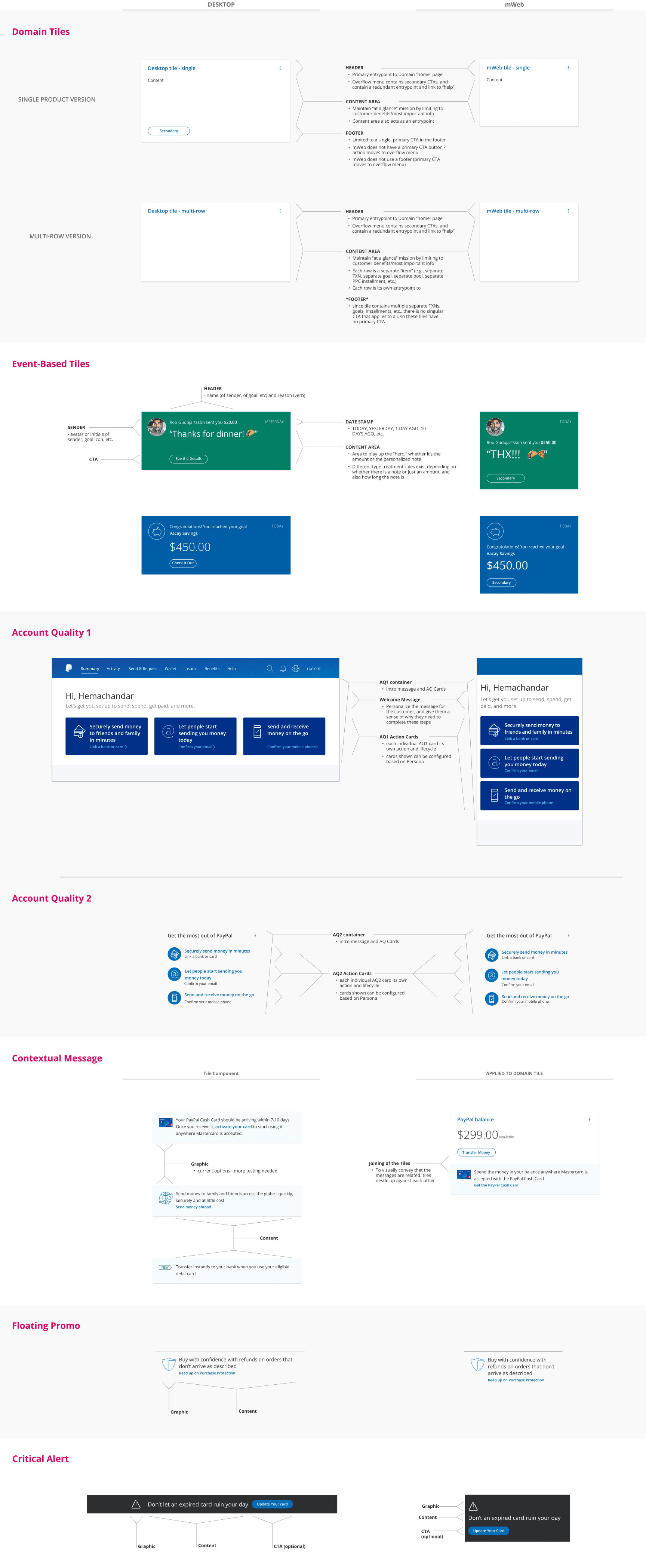
Defining the Building Blocks
Defining the Page Layout
Starting with pencil and paper (or pen, if feeling brave) for rapid ideation, then lo-fi wires to get paper prototypes in front of customers and gather qualitative feedback on early structural concepts and IA.
Concessions based on internal direction weighed against customer feedback
Customers felt left nav was more standard for a FinTech dashboard, but company felt it was too big of a global lift from existing top nav
A 7/5 Bootstrap grid to allow quicker engineering build time
Left column housed core account tiles and was designed for primary hierarchy
Right column was secondary tiles and actions


4. Systemized Messaging Framework
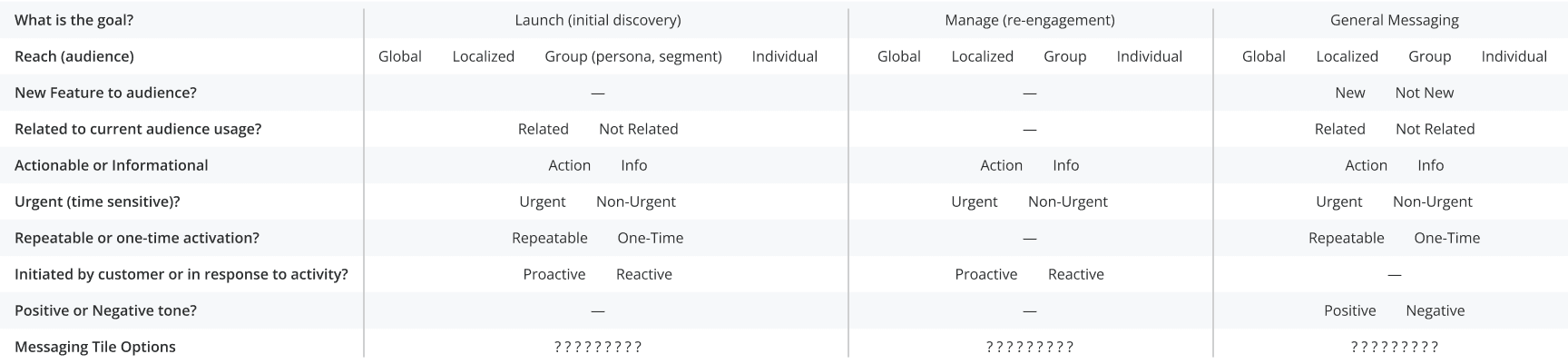
Saving the Customer from an Avalanche of Messages
Each feature team thinks their message should get highest priority placement for every customer, but not every customer needs every message or at the same time.
Based on input and goals from the respective feature teams, a structured set of messaging touchpoints was defined and documented.
With a hierarchy of importance correlated with visibility, structured yet flexible rulesets were established to avoid overwhelming the customer or creating “banner blindness.”

How might we get extended product teams to understand the guidelines and improve how messaging is planned?
Partnering with a Product Director, he and I developed a “Decision tree” model for autonomous messaging placement
Reduced bottleneck and increased release speed by empowering extended PMs to autonomously figure out messaging placements
Helped to educate and improve messaging efficacy through more efficient audience targeting in order to procure better placements
For instance, blasting a message to “all users” should land in a low-priority placement.
But refining the audience or trigger (ie. “balance carrying customer who just sent money twice in 30 days”) would make that message more relevant to that cohort and get a higher priority placement.
The age-old quality vs quantity debate.

Pressure Testing with Real Scenarios
Pressure testing with two product teams, we mapped out how different placements combined with extended timelines could have a positive effect on customer comprehension and engagement
A smarter messaging system could increase longer term engagement by being smarter about when messages are shown based on relevance to the customer
Prevent customers from being overwhelmed by an avalanche of messages from each product all on the same day
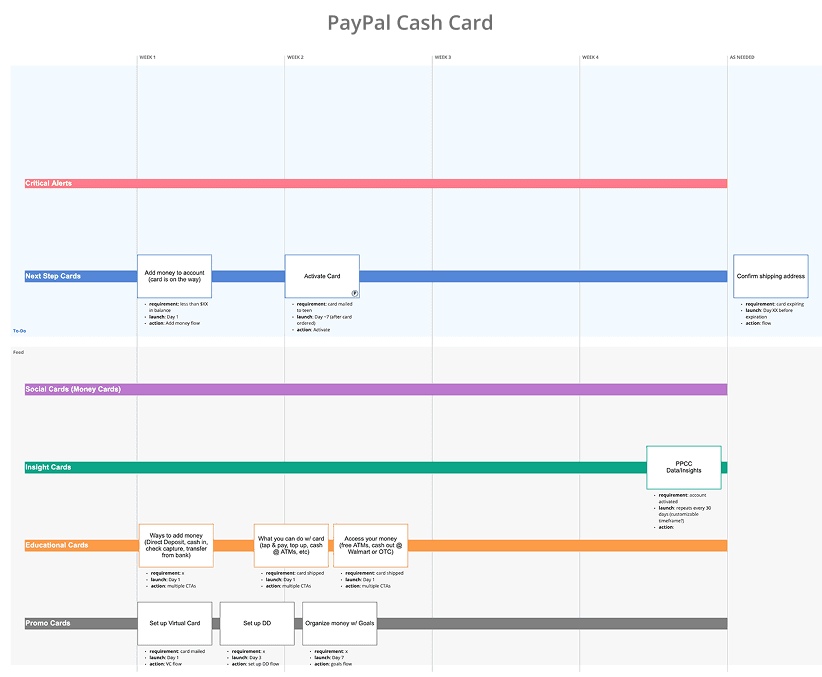
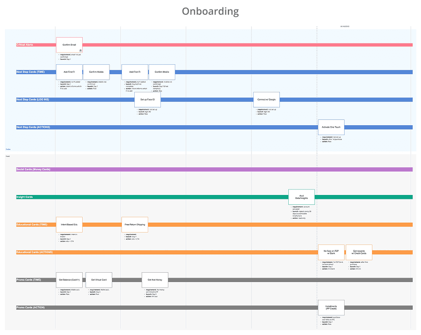
5. Self-Service UI Component Framework
Reducing the Bottleneck and Empowering Extended Teams
A component-based UI tile framework accessible via the internal design system
Partnered with the PayPal Design Systems team to create reusable, global components
Individual 3-in-a-box teams could own and experiment with their respective Home tiles
Applying visual hierarchy design principals to separate primary and secondary tiles based on customer-informed importance
A dual-layer (visual z-index) UI treatment
Primary tiles are wrapped in a floating, contrasting container
Secondary tiles, messaging, and actions were placed flat on the background

6. Usability Testing – Before, During and After
Customers informed design decisioning along every step, from discovery research through paper and hi-fidelity prototypes
There were significant rounds of research, testing, and iteration sessions that supported the design direction along the way, including:
Leading in-person usability and discovery sessions face-to-face and behind a one-way mirror and mic (self-service model)
Moderated and unmoderated studies
Low-fi paper prototypes and IA card sorting
High-fidelity click-thru prototypes (Axure, Invision)
At-Home visits and interviews
Listening sessions in our Call Centers
Focus groups and brainstorming with our Call Center agents
In-experience surveys (creating questions and interpreting results)

7. Flexible Lifecycle Framework in Action, from New to Power User


8. Takeaways
Less design and more facilitation
The Dashboard framework and each product tile needed to work for a handful of extended product teams, each with their own needs, use cases, and KPIs
Running cross-functional design jams, workshops, and pressure-testing sessions helped bring teams along on the journey, garner buy-in, reduce churn, and produce more scalable solutions
The democratization of design
Hands-on collaboration helped illustrate the complexity and the need for a strong, yet flexible, cohesive framework
Allowing autonomy and ownership for teams to evolve and experiment post-launch helped bring everyone on board and meet individual KPIs
Concessions and hand-offs are common
Based on my own POV and hearing supporting feedback directly from customer interviews and testing, I was really pushing for a left-hand navigation model
Deemed too big of a change (and lift) for the backend and was denied by leadership
The Messaging Framework I mapped out in partnership with the Product Director could have been really helpful for internal education and process but was never formally adopted
Instead, a machine learning model was being built to handle this same concept even more efficiently