
1. Overview
As the Lead Product Designer on the Business Mandatory Durable Team, I led a horizontal initiative redefining core PayPal account structures to meet new government regulatory and compliance requirements.
I drove iterative design and content improvements based on in-person moderated usability testing, live quantitative AB experimentation, and qualitative customer survey feedback, ultimately increasing CTR by +20%.
I also influenced a regulatory reversal impacting customer satisfaction and revenue outcomes by partnering with Legal to produce documentation and research to support their successful challenge of the new government regulations.
Role
Lead Product Designer
Collaborators
Content Designers (x2); Product Managers (x2); Engineering; Design Systems; Marketing; Legal; Analytics
Methodologies
UX
UI
Prototyping
Usability Research
Live Experimentation
Stakeholder Buy-in
Company
PayPal is a leading Fortune 200 FinTech operating a global P2P and online payments platform with nearly 500M active accounts and a total payment volume of more than $220B.
Challenge
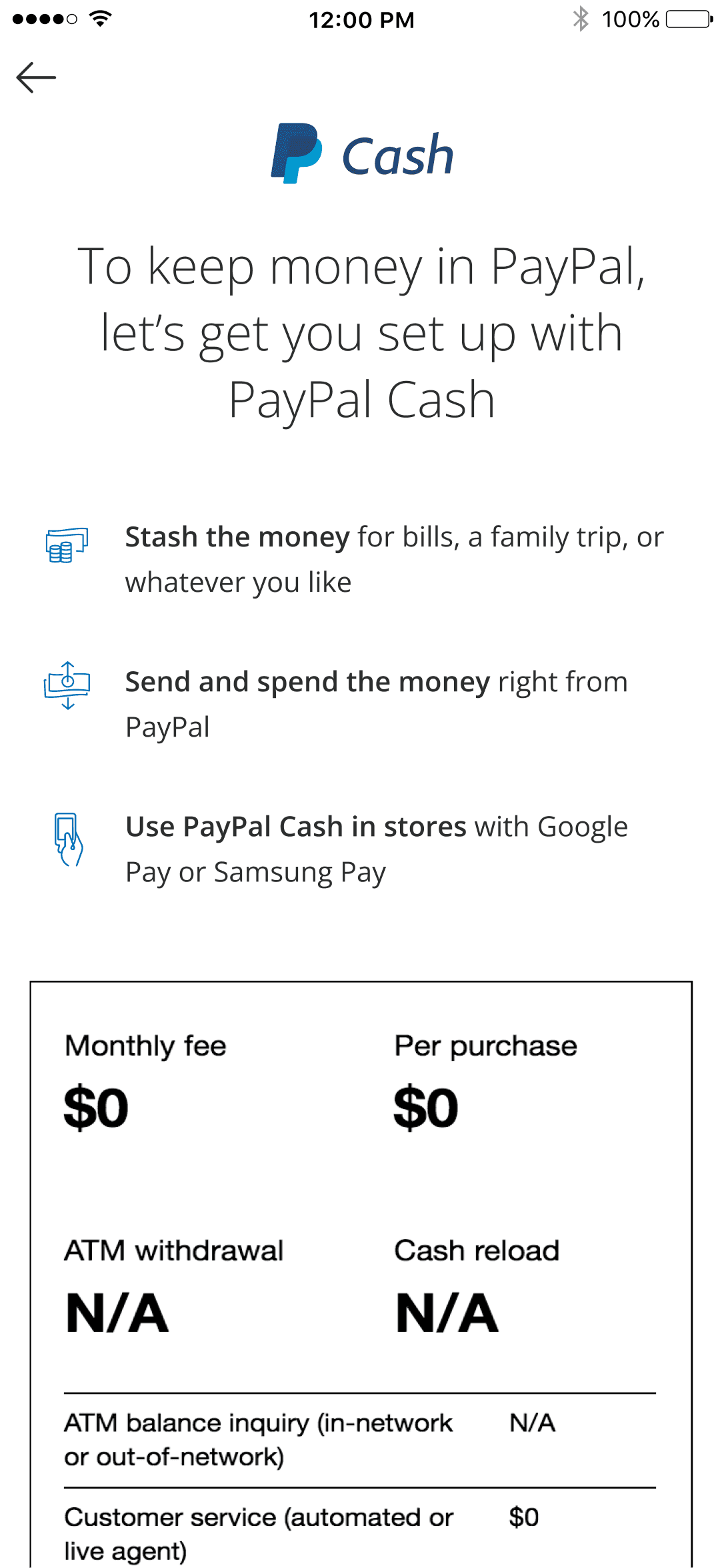
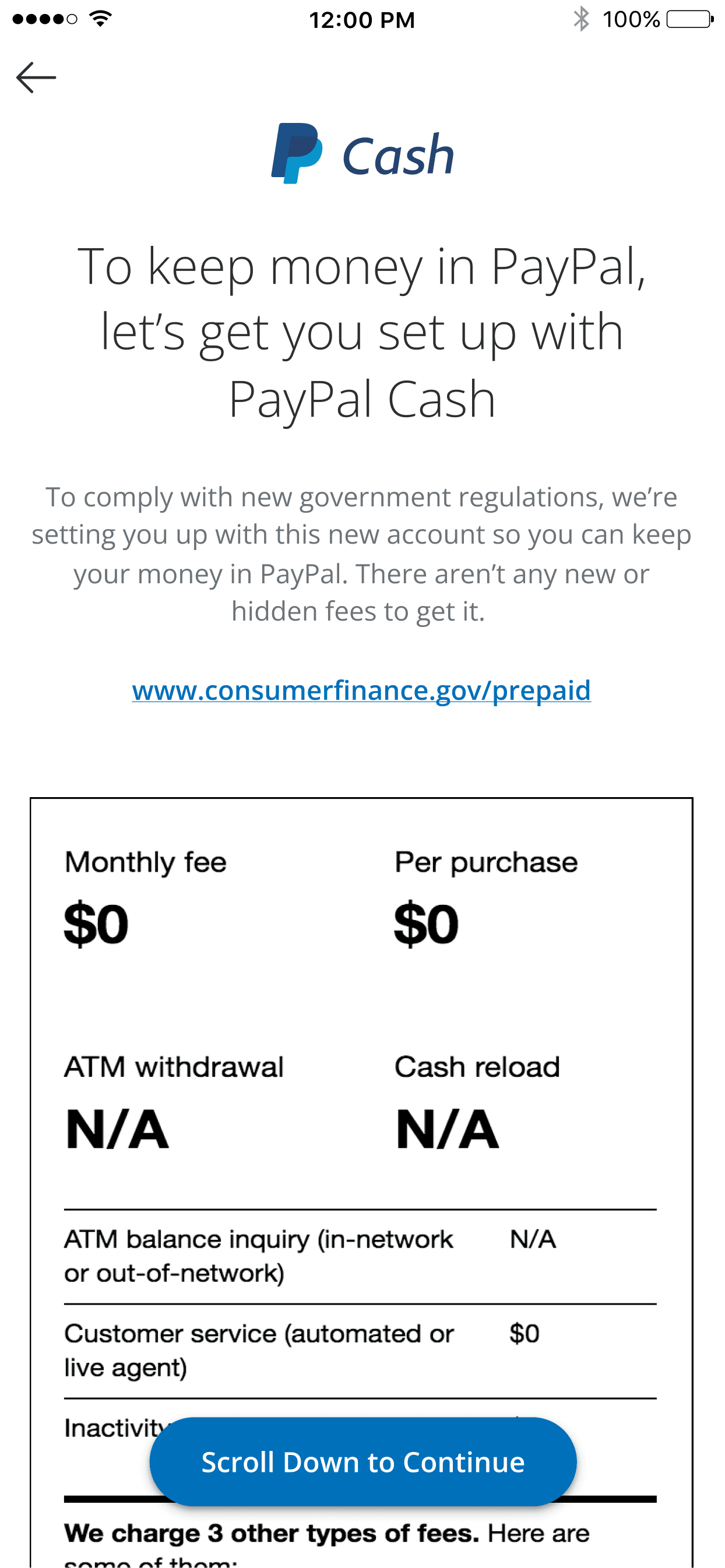
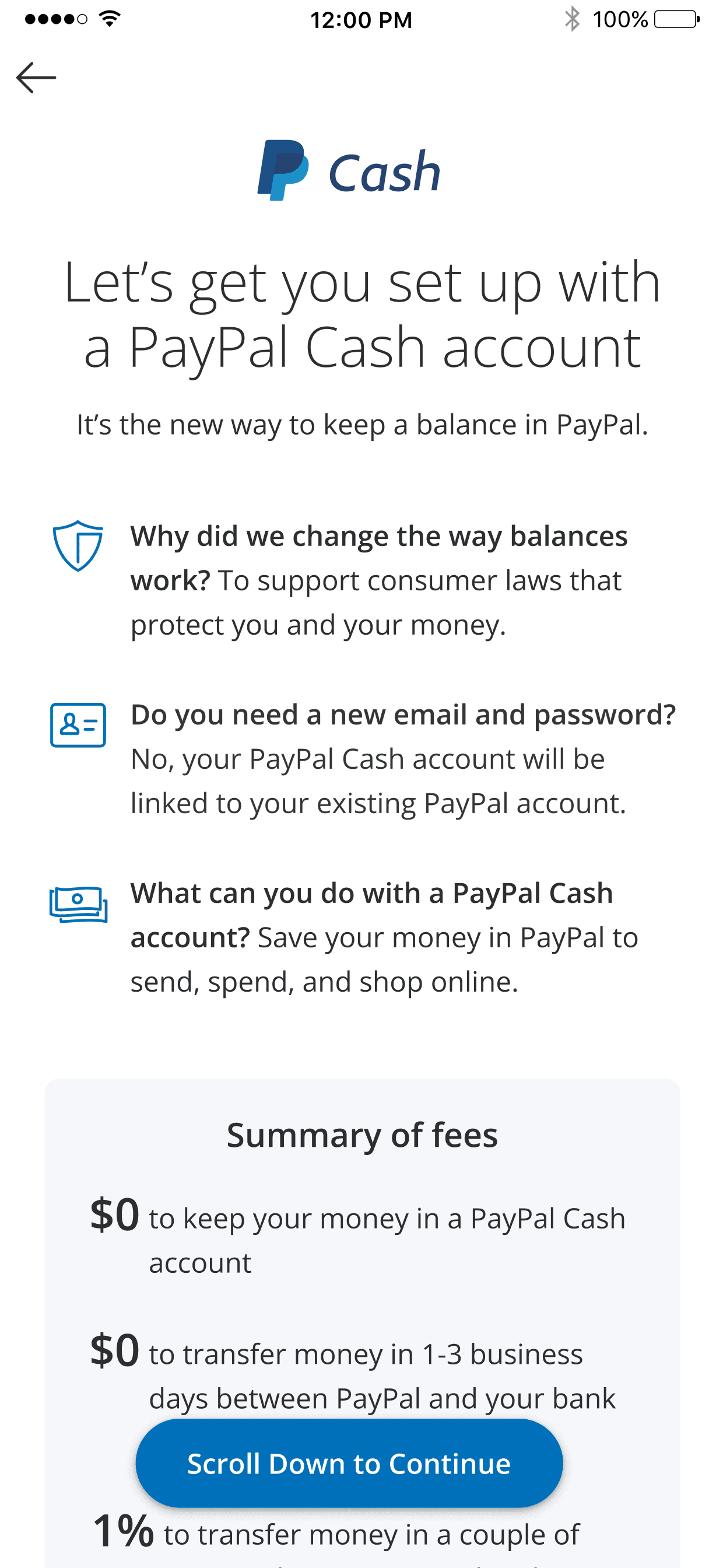
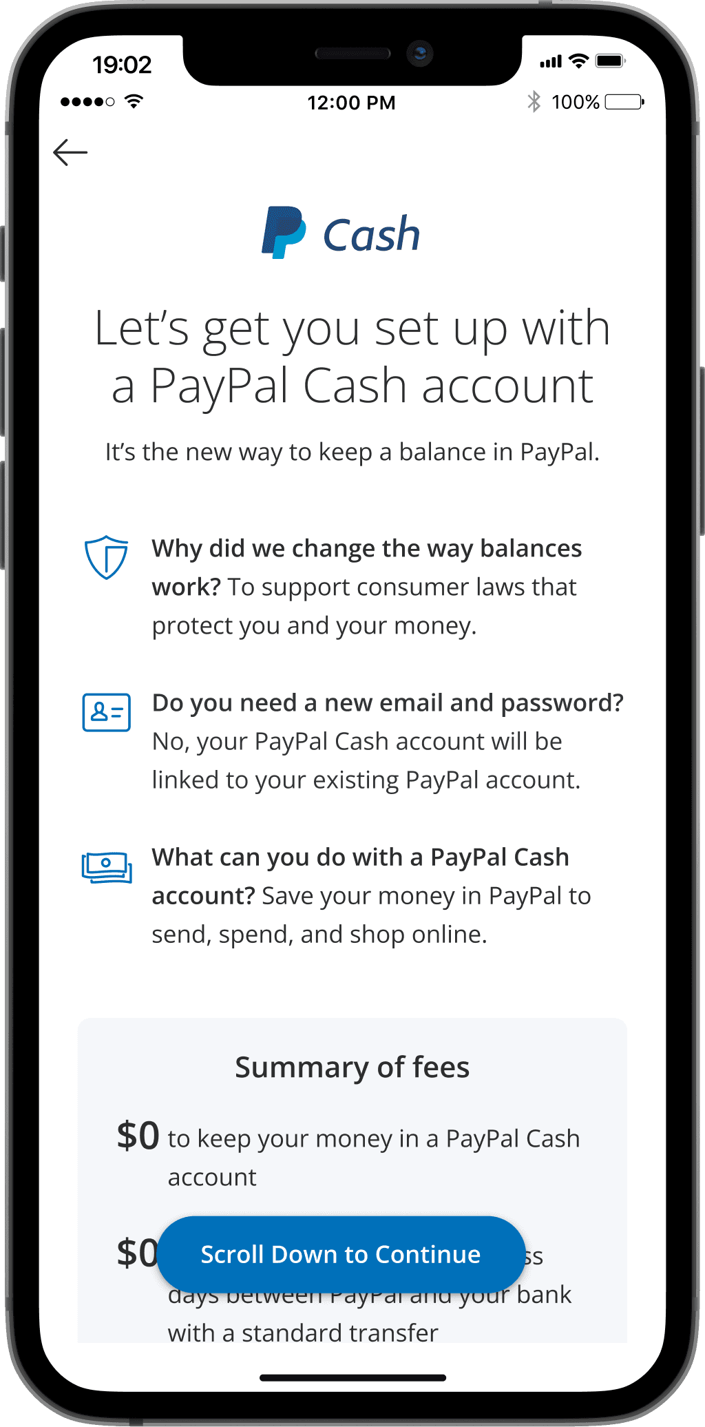
The CFPB passed new regulations to protect customers from predatory behavior and hidden fees associated with “prepaid cards” that hold a balance. PayPal was targeted because of it's existing, free balance feature, which technically does not function as nor is viewed by customers as the same type of balance on prepaid cards.
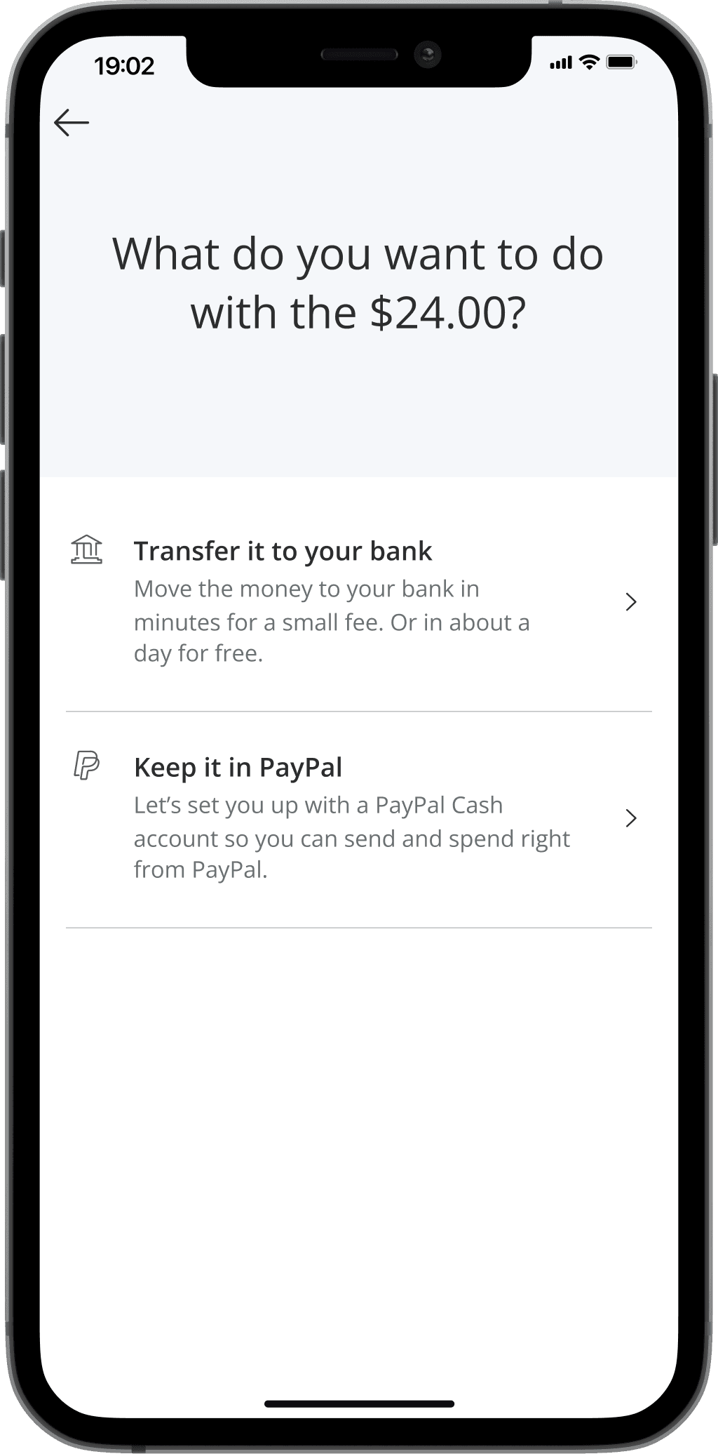
The business and compliance decision was to no longer allow a balance by default, but require the customer to opt into 1 of 2 types of subaccounts that would be able to hold a balance.
Requirements
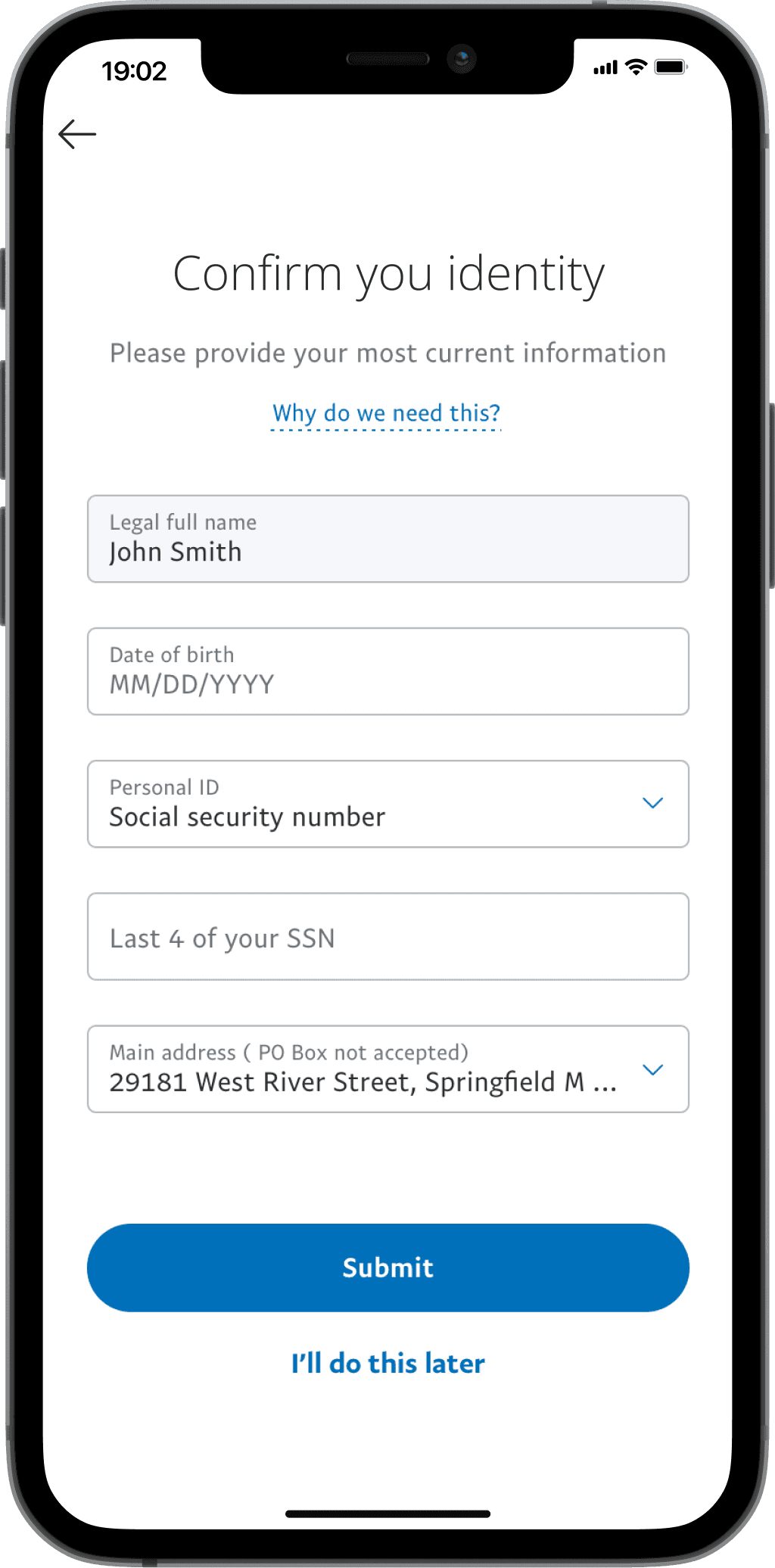
New and existing customers would be affected by the new account structure
CFPB supplied very strict short- and long-form disclosures and legalese
If customer does not want the subaccount, they can transfer the balance directly to their bank
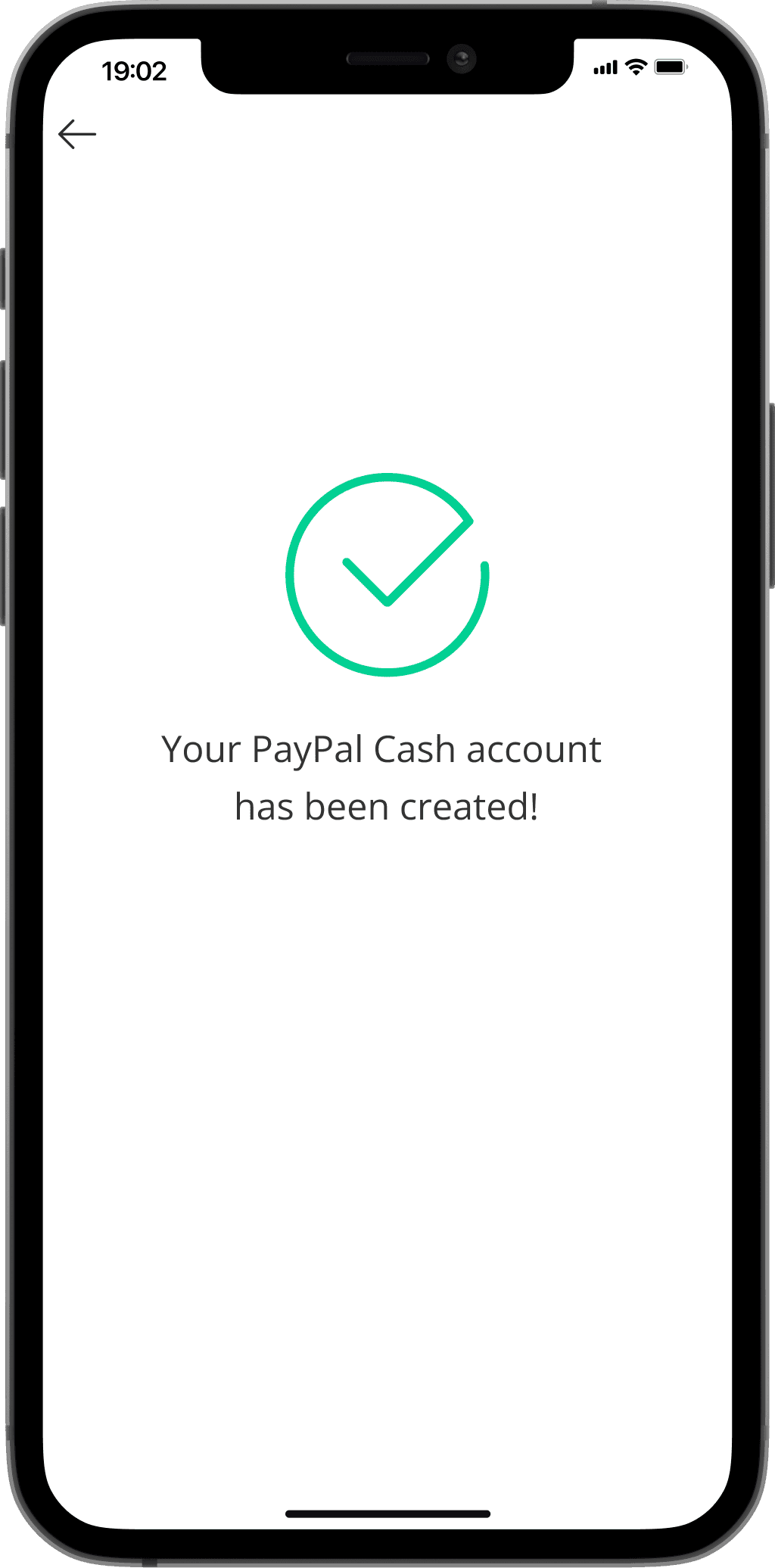
PayPal Marketing named the 2 new subaccounts – PayPal Cash and PayPal Cash Plus
The subaccount structure, new subaccount names, and effectiveness of the identity verification process were not part of my scope
Goals
Guide customers through the option to create a new subaccount or transfer to their bank
Instill customer confidence and comprehension of the new regulations and account structure
Reduce confusion around the “missing” balance feature for previous balance holders
Key Metrics
+20%
Click-thru-rate increase
on disclosures screen
305M
Active PayPal accounts
affected by this change
>2.8M
PayPal accounts
with a balance
3
Feedback channels:
moderated, live experiments, in-flow survey
2. User Journey
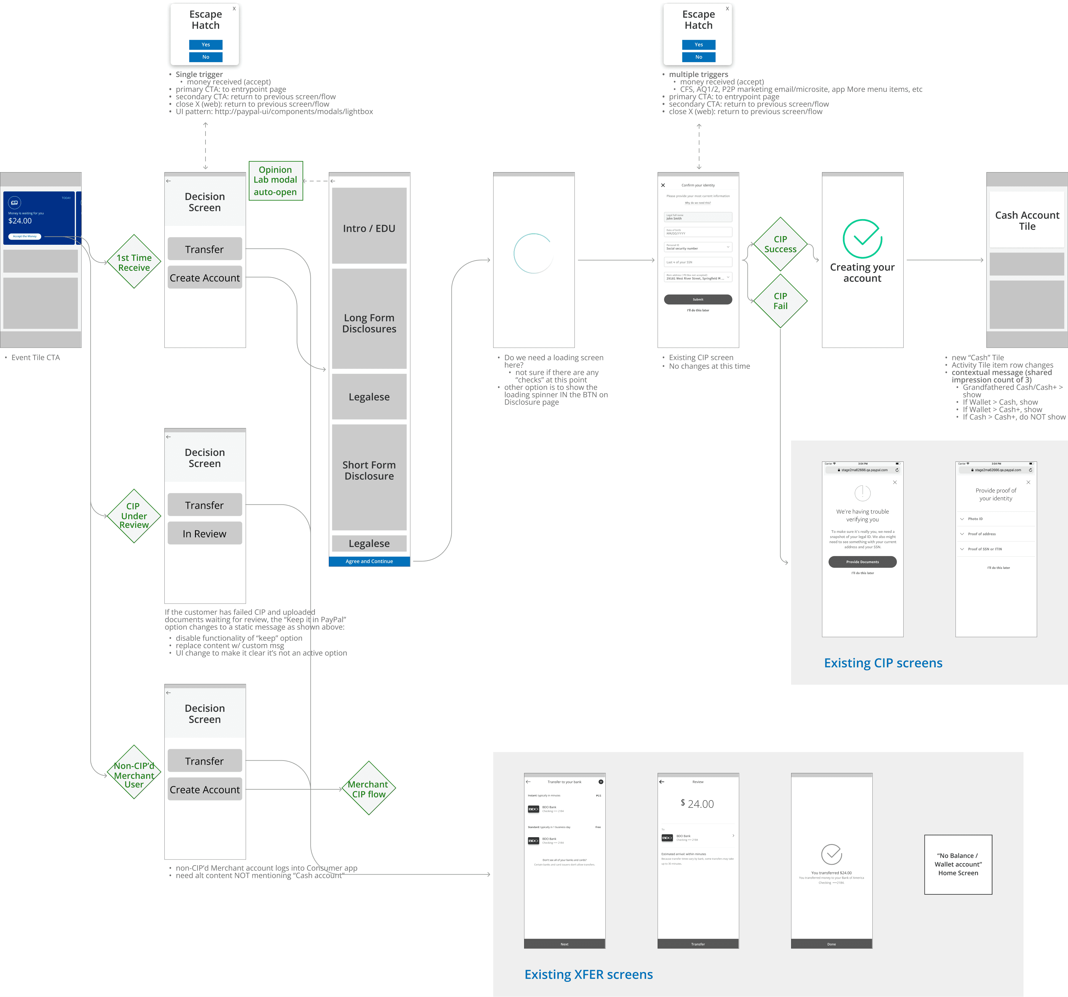
How might we prevent confusion for existing customers around the disappearing balance feature?
Solution
Show a variant of the familiar Balance tile that that explains why they are not seeing the normal variant, and how to proactively set up the new Cash account
Send emails and logged-in notifications alerting to the upcoming change
3 month lifecycle
If “Receive Event Card” or “Cash/Cash+ account tile” is active, do not show this tile anymore
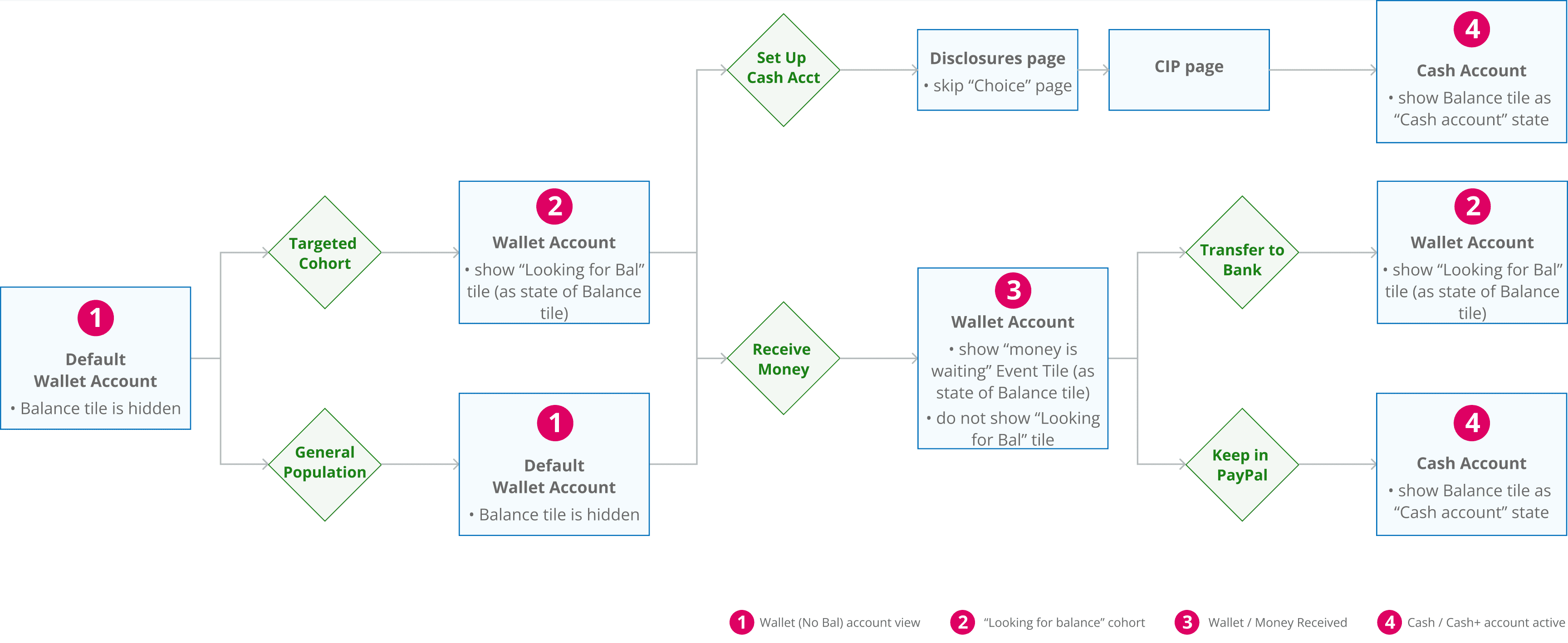
Target audience
~2.8 million customers who held a balance in the past 12 months
Have now been flipped to a "No Balance" account

3. Usability Research & Key Iterations
Multiple Customer Feedback Channels to Better Inform the Solution
In-person moderated lab usability testing
A “Self service” model set up by UXR for self-led sessions
High-fidelity prototypes run through eye- and hotspot-tracking hardware
I wrote scripts and conducted interviews for qualitative results
Live experiments
Multiple rounds of AB testing around design and content iterations
Worked with the Analytics team to parse quantitative data
Contextual Surveys
A short pop-up survey when the customer backed out of the Disclosure screen added qualitative data to the hard numbers
I reviewed the survey results weekly for insights on how to improve conversion
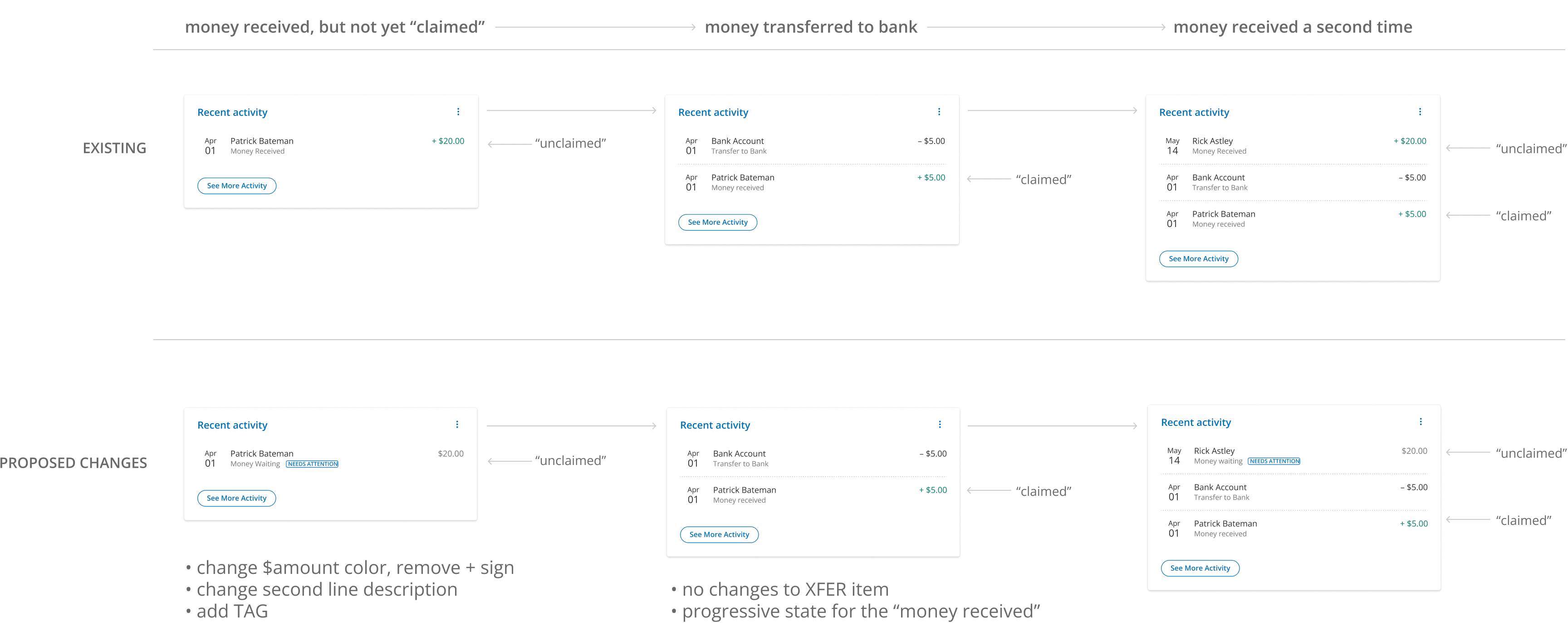
Iterations based on customer feedback and data led to an increase of the Disclosures screen click-thru-rate by 20%, from 62.6% to 75.1%.
Key Learnings to Solve For
Simply being shown a fee table, even with $0 fees, caused customers to think there were new or hidden fees
“Why are you showing me all these fees now after I’ve had my account for years? It makes me think there will be hidden fees.”
“Why are you charging fees when PayPal has always been free?!?”
SPOILER ALERT: there were no new fees and keeping a balance still had a $0 fee
The new account names – PayPal Cash and PayPal Cash Plus – were confusing and offputting
“I just want my money, not some weird new cryptocurrency!”
I proposed changing the names to simply PayPal Balance and PayPal Balance Plus, but too many investments were made in marketing already
Who moved my cheese?
Changing the product structure for a well know, core feature after years of familiarity was a difficult barrier to overcome
Disclosures Screen – Key Iterations
Progressive disclosure vs less clicks
Hypotheses
EDU content and disclosures on separate screens would allow for more focused comprehension, but more clicks
EDU content and disclosures on the same screen would make the flow less cumbersome, but possibly overwhelming
Impact
Pre-launch moderated lab testing
Less screens made the flow “feel like less of a process”
Customers blindly click thru the progressive EDU screen without reading
Comprehension was improved when shown on a single screen
Multi-Screen Option

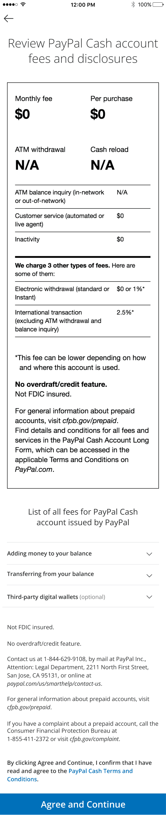
Single Screen Option

Control – 62.6% CTR
Chevron BTN – 64.4% CTR
Text BTN – 68.9% CTR

Control – 68.9% CTR
Opt B – 74.7% CTR

Opt C – 75.1% CTR

4. Final Flow


5. Takeaways
A “successful failure”
Positive data does not always equal a positive user experience
Regulations may be well-intended, but still negatively affect the customer
Informed iteration
Moderated lab testing, live experiments, and contextual surveys each provide slightly different angles and insights
A marathon, not a sprint
Push back a couple times, and if unsuccessful, let it go and move forward
Sometimes it takes multiple rounds for influence to, well, influence